Green Light
My Role
UX Designer
Timeline
4 Weeks
Product type
iOS Application
Team
3 UX Designers
PROBLEM 💭
The roots of the problem
Although individuals are often interested in aiding environmental causes, they experience barriers in access to potential opportunities like volunteering or petitioning government representatives.
Citizens looking to create a path towards outreach experience difficulties in navigating existing governmental structures and websites. Furthermore, people are often not aware of the scope of volunteer opportunities available or where to find them locally. And we assumed that:
There are many types of actions to take through policy locally, state-wide, or nationally that many aren’t informed of.
Individuals get overwhelmed by the dearth of available options, research demands, and disparity of available options.
People may not be aware of the full scope of ways to aid in environmental causes, beyond monetary donations.
SOLUTION💡
Giving the Green Light to activism!
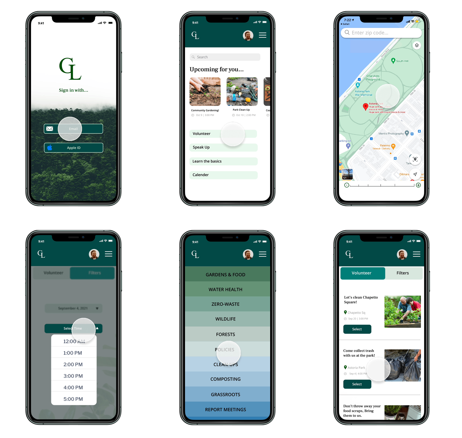
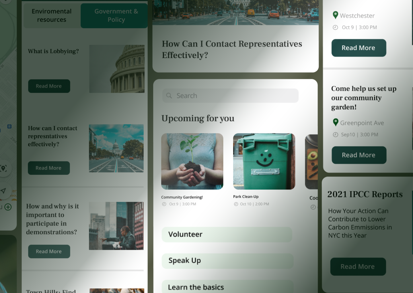
Our team created a platform for inspired individuals who would like to learn and be part of such activities that are happening in their area allowing them to act upon environmental causes while having a great time.
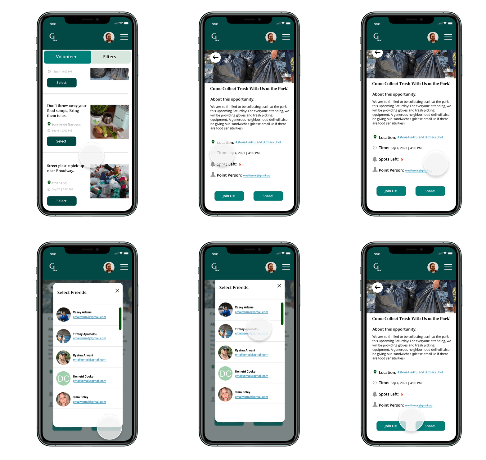
Invite friends to join you!
With Green Light, you can share events and opportunities with friends for further community involvement.
Narrow your search
When looking for opportunities using Green Light, you can filter your search based on preferred time, date, and location that best suits you.
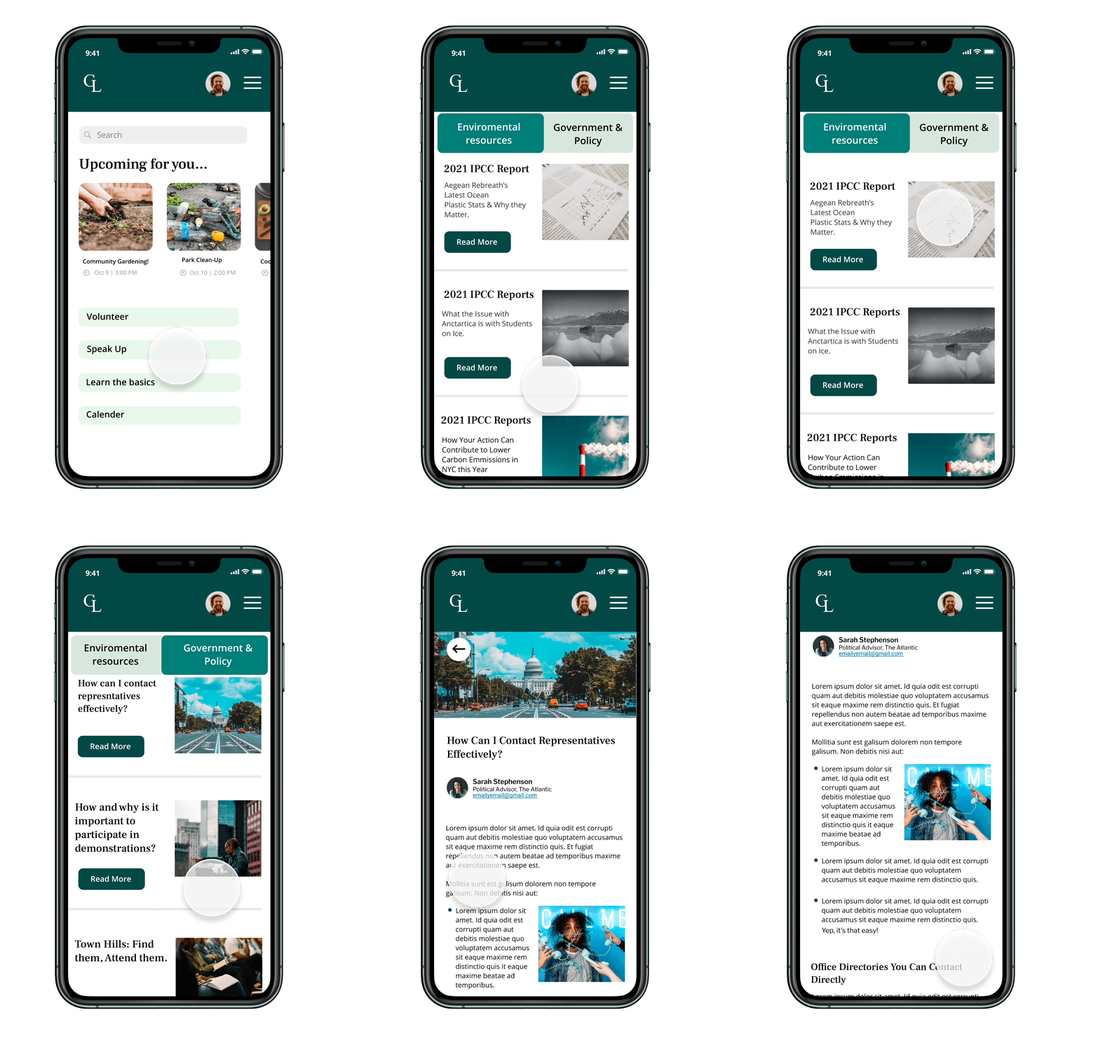
Contact representatives effectively
With Green Light, you can learn how to contact representatives effectively and get informed of the latest environmental causes reports all in one place!
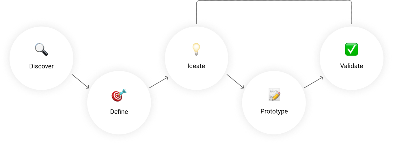
UX PROCESS 🛠
COMPETITIVE ANALYSIS 📊
There is no consolidated platform to find opportunities for action
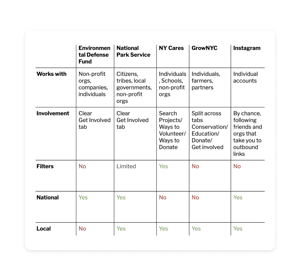
our team researched the market we intended to insert ourselves within. We noticed there was no consolidated platform or website where individuals could find opportunities for action, while specialized vocabulary often hindered them from looking further, or contacting representatives. So we began mapping out the features and offerings of organization websites, as well as some social platforms our interviewees had mentioned.
USER INTERVIEWS 📝
Defining the problem
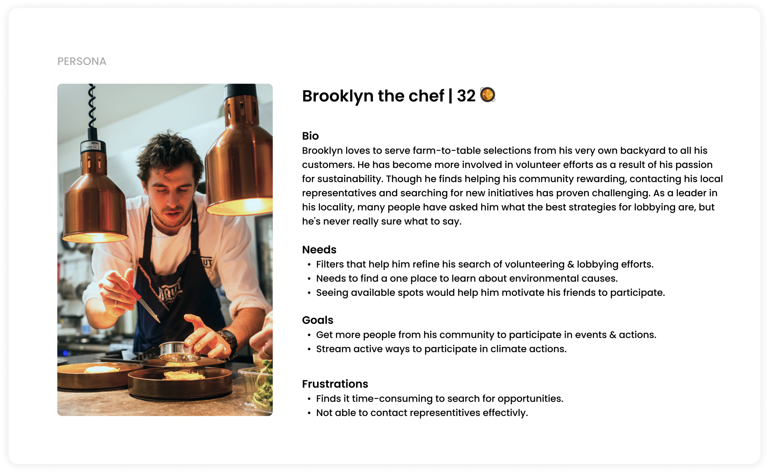
We started our user research by conducting 8 user interviews on a group of people with diverse backgrounds all of whom have causes they care about and have, in some way or another, sought to support them. As a result, we found many insights
that helped us understand the barriers that are preventing them from taking action.
MAIN INSIGHTS 📌
It is difficult to find the right opportunities
Based on Affinity mapping, we noticed that almost all the people we interviewed didn’t know how or where to find opportunities. They struggle to find trustful information about the causes they care about and they feel that they can’t do much.
AFFINITY MAP TRENDS:
-
We heard from 90% of our interviewees that they find it very time-consuming to search on websites and different platforms for information which is a huge barrier that is preventing them from taking action.
-
The interviewees also mentioned that they struggle to find opportunities that suit their schedules or locations.
-
According to our study, 88% of participants are more likely to volunteer and take part in such activities when they have a friend accompany them.
-
It is very difficult to reach a representative and to find explanations of scientific or legal jargon.
DESIGN WORKSHOP ✍🏻
Ideating solutions
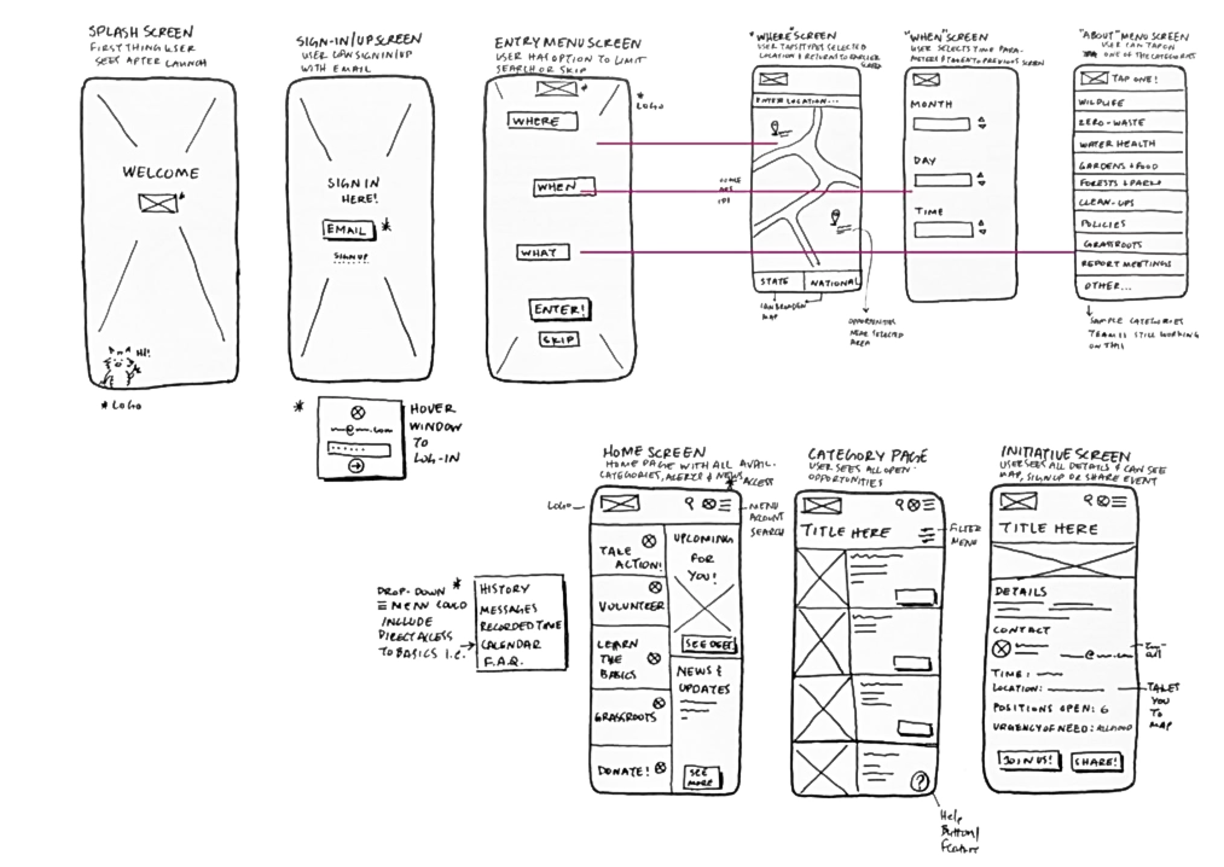
After knowing our user’s needs, we then went on to ideating by running a collaborative Design Studio session with all our team members where we all rapidly sketched out initial screens and ideas then narrowed them down to a few final designs that we all agreed on.
By doing a Design Studio, we were able to engage more with our team members and discuss a variety of ideas that helped us identify the main features of our platform for the next design phase.
PROTOTYPE 🖇
Paper to digital
After we agreed on a few designs, we turned our designs into Mid-Fidelity wireframes and prototypes that were set out for usability testing and feedback. By doing this, we were able to have an early vision of what our product looks like and add any new iterations if needed after usability testing.
(( Click the left and right buttons or tap anywhere on the slides below to see the Mid-fidelity wireframes ))
⇩
TESTING & ITERATIONS 📲
Aiming for the right outcome
We conducted usability testing sessions with 18 users and based on the feedback and user behaviors, we were able to iterate and refine the design solution.
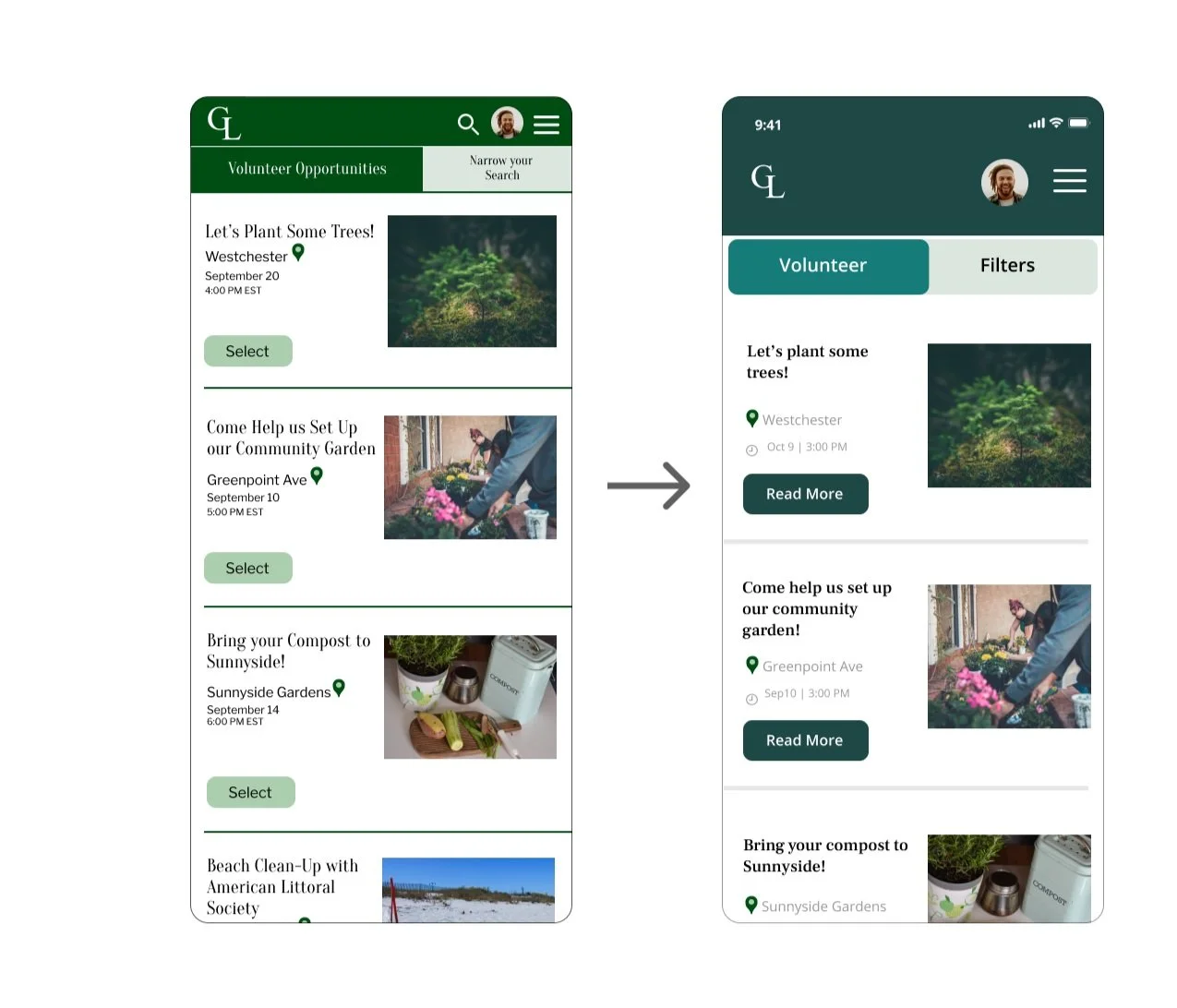
Information architecture redesign
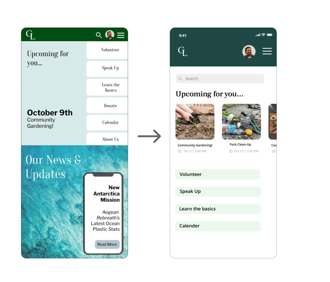
With guidance from my mentor, I was able to fix the home screen layout and make it more clear.
I Removed the news section from the bottom navigation because it wasn’t really needed.
I made the upcoming events a carousel layout for users to navigate through with ease.
And I added a navigation search bar on the top for users to search for what they need.
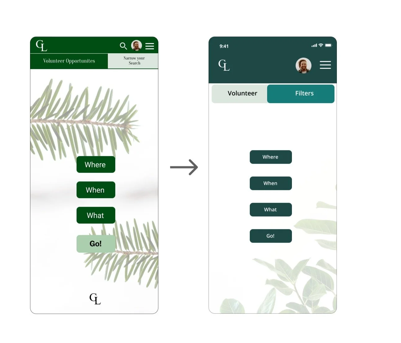
Easier Navigation
We noticed that the navigational toggle switch on the top was very small and the wording was frustrating and so, I fixed how it looks by making it larger and less wordy.
EXAMPLE: ( Narrow your search ➔ Filters )
A better User Interface!
Because of my Visual design background, I have noticed that there is a need for some changes in the way things look to give Green Light a more modern and simple look. Here are the changes that I made:
I changed the main color gradient to a more bluish tone to give it a more appealing look.
I changed the background to a more simple design for accessibility ease.
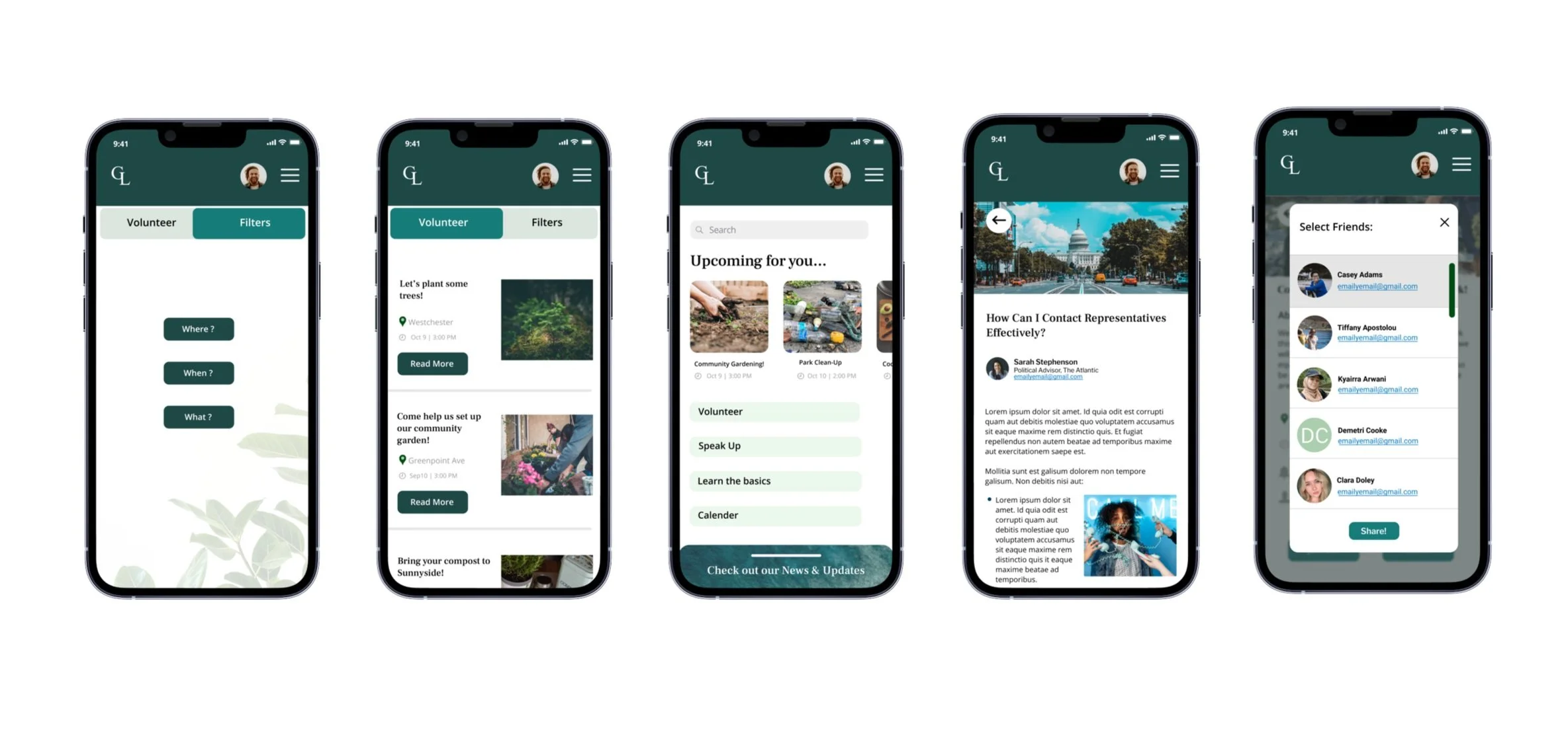
THE FINAL SCREENS ✨
The Road To Environmental Action!
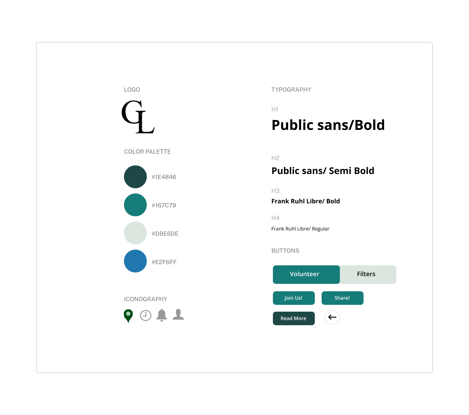
STYLE GUIDE 🖼
A Design that inspires
CONCLUSION 📖
Moving forward...
Greenlight is a very inspiring project that I have worked on and would love to have it turn to live one day!
Here are a few next steps that we plan to do moving forward:
Considering a partnership: After careful consideration of our research findings and the values, we want to instill in our product our team considered the possibility of collaborating with The Atlantic, a print and digital news platform with sections on science and the environment. They are known for being credible, unbiased sources of information. With environmental/scientific slant. The Atlantic also has a large active audience and a history of brand partnerships.
Andriod platform: Create our app for android users.
Additional testing to better structure information architecture following task four insights.
Meeting with our partner to implement a survey identifying the need for our product in the market.
Potentially adding a chat feature to further engage community members.
“I would love to use Greenlight! I have a deep passion for taking care of our environment and couldn’t think of a better platform that helps me feel so involved. ”
— Alex J
REFLECTION 💌
It went well!
Greenlight was one of my favorite student projects, where I was involved in the UX process from beginning to end! Having worked with an incredible team and meeting new people, I came to realize that there aren't as many ways to help aid the environment as there should be, and that activism is urgently needed. Greenlight is a road to environmental action that will help not only people but the world.
This project gave me the opportunity to learn, grow, and gain many new skills that enhanced my design skills.
